
PROBLEM
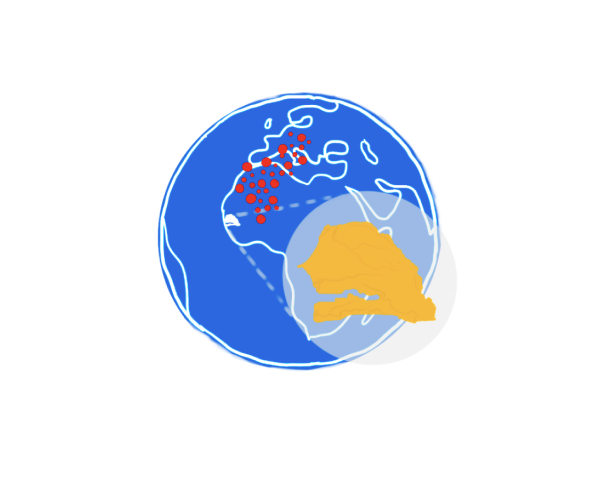
Senegal was entering the COVID-19 pandemic as the rest of the world was: with limited knowledge and tools to educate citizens and fight the spread. Our team was hired to create a solution based in accessible technology with a low overhead for users- the primary goal being widespread adoption and retention.
SOLUTION
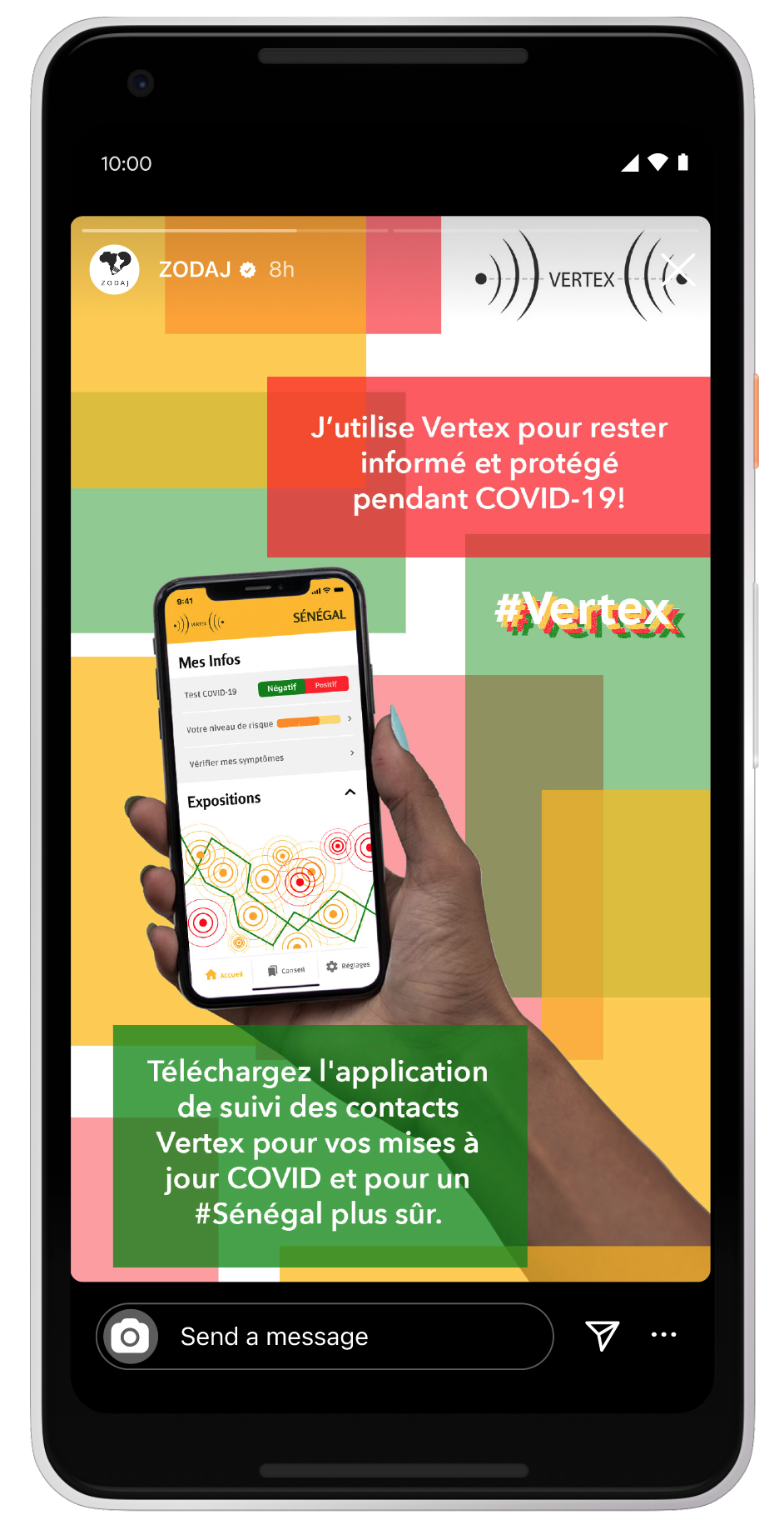
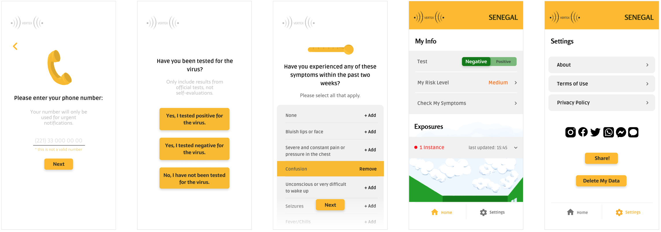
As the lead designer for the mobile app, "Vertex" provides a simple data collection & warning system for the Senegalese to track COVID-19 in their communities, protect themselves and their families from exposure, and report their symptoms and status to provide leadership with a source of knowledge about the virus' effects on their community.
TOP-TO-BOTTOM APP DESIGN
FINAL DESIGN
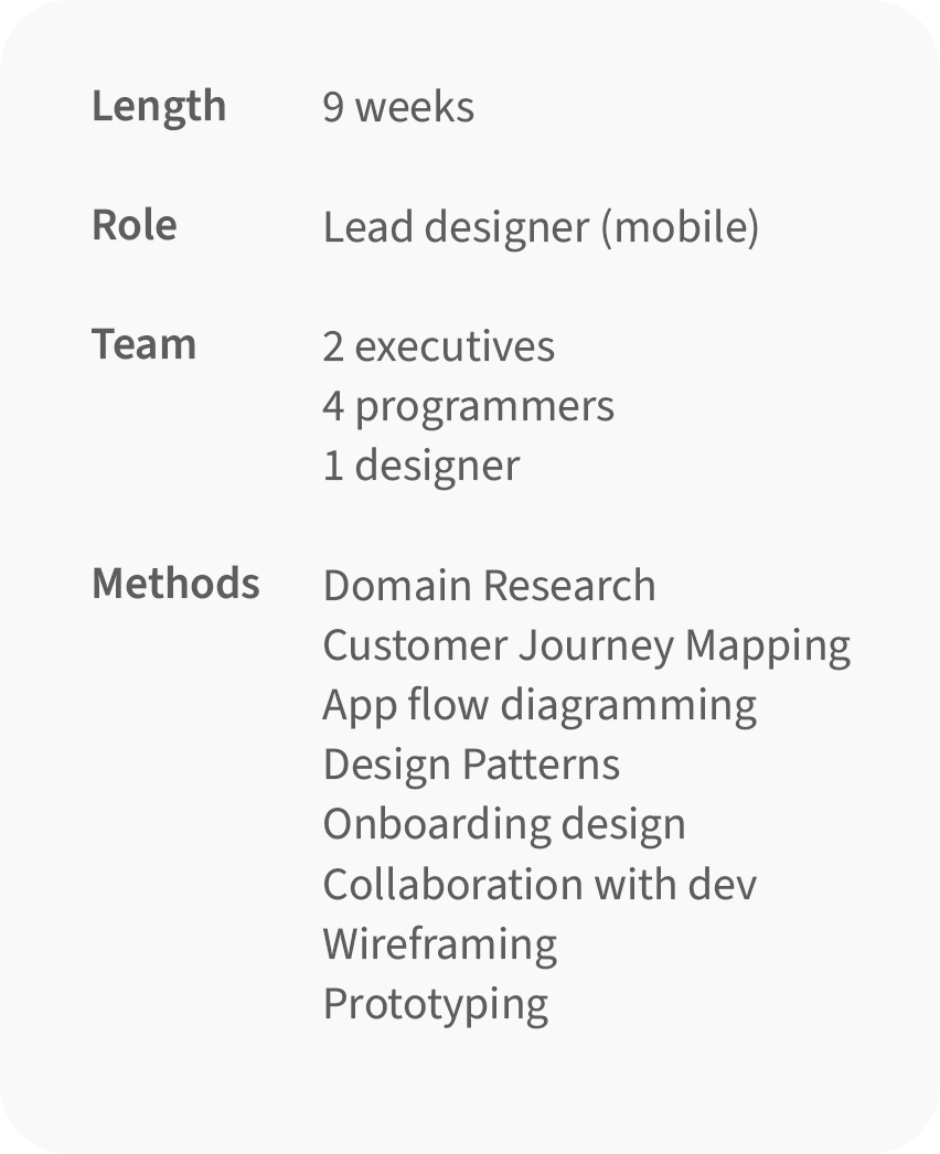
I conducted research, created a design system, prototyped, tested, and copywrote for the app with support from the executive and development teams. Below are the main features of the app at the conclusion of my work:
ONBOARDING FLOW
- Streamlined to only collect the most necessary information for contact tracing
- Ensuring the user understands what data was being collected and how- especially since it is health information
- Collecting info for app set-up and immediate advice, like if they have been tested, and whether they have experienced any symptoms recently
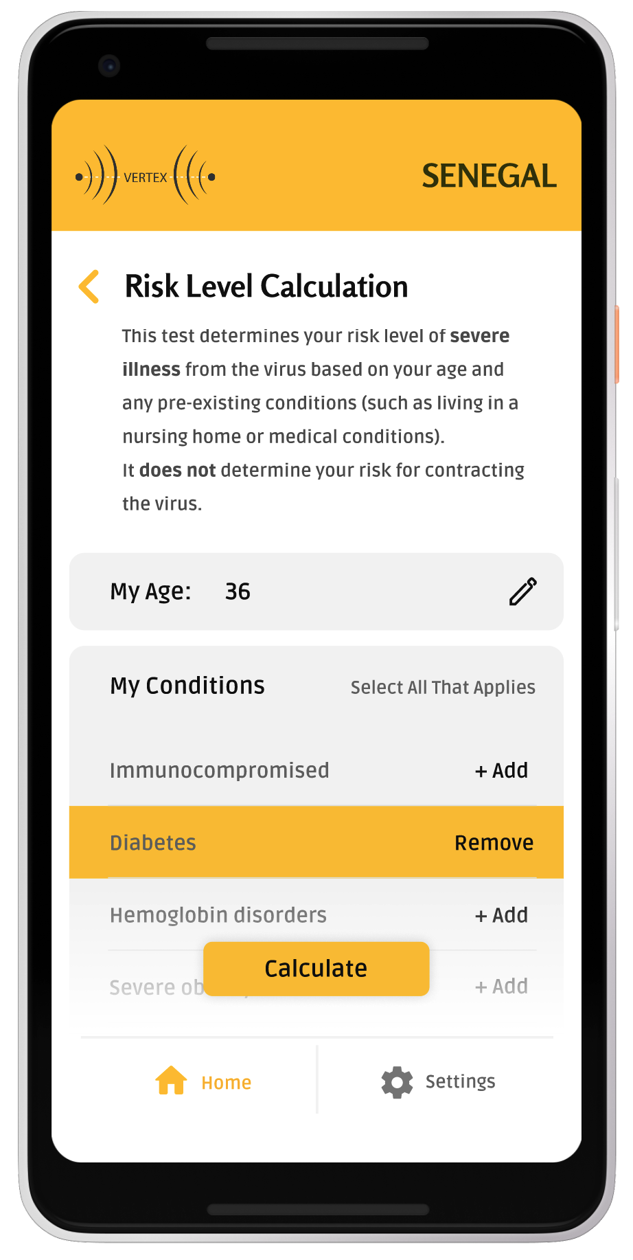
DASHBOARD FEATURES
- Test - current testing status for alerting nearby phones
- Risk Level - allows user to check for likelyhood of contracting a severe case based on their pre-existing conditions
- My Symptoms - provides an easily accessible list of warning symptoms, and allows for recording time period of symptoms
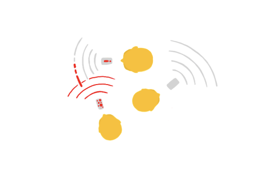
- Exposures - contact tracing system that notifies of exposure to spaces or people who have recorded positive cases
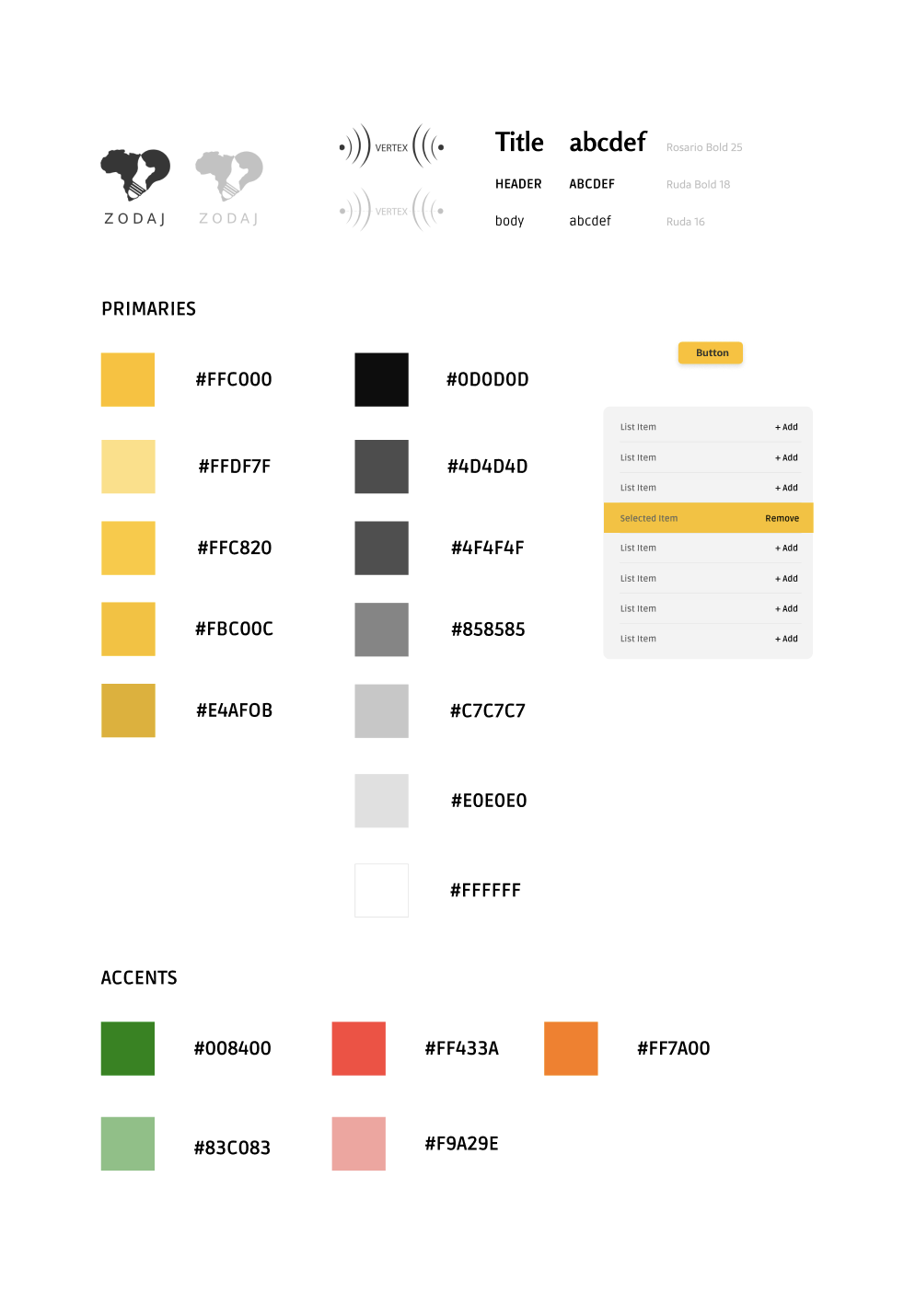
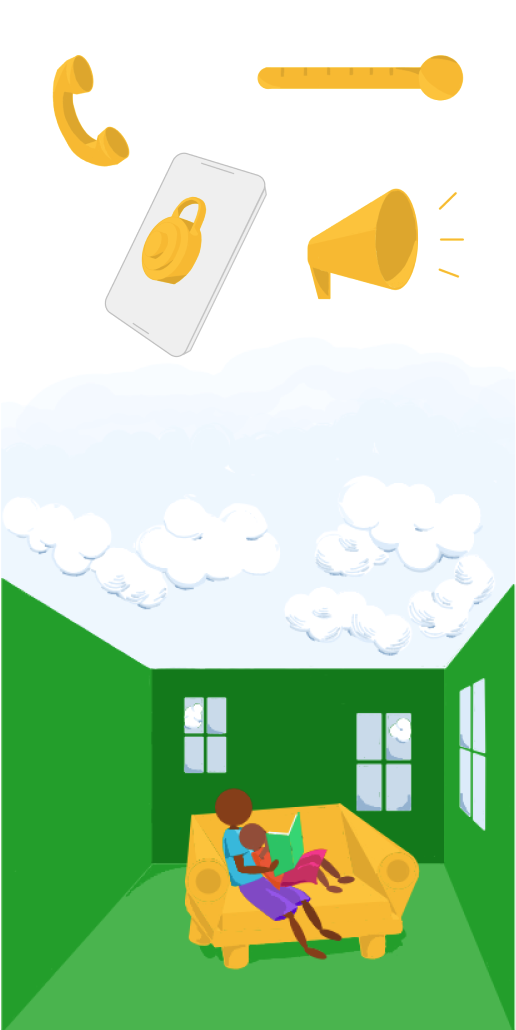
DESIGN SYSTEM, ILLUSTRATIONS
- Created a design system for the app
- Created digitally hand drawn, stylized icons and illustrations to visualize concepts throughout the app
- Designed advertisements for marketing on social media
- VERTEX Logo designed by Amen Assafa, CSO
COPYWRITING & FEATURES
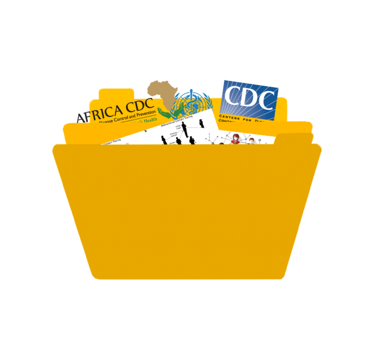
- Primary copywriter for the app- all healthcare and COVID information was sourced from several world health organizations (WHO, US CDC, Africa CDC), and updated periodically.
- Close communication and updating for the development team on new prototype iterations and features
SENEGAL'S COVID-19 DILEMMA
BRIEF
As the COVID-19 pandemic took off, government, academic, and community-based institutions around the world began to assemble teams to enact solutions at a local level to allow individuals to make more healthy decisions and slow the spread. Contact tracing emerged as a social-science backed approach, but varying trust in data security and national governments proved challenging barriers to overcome. These issues, along with varying access to technology worldwide, made it impossible for a widespread solution, instead requiring one more tailored to the cultural and political climates of individual countries and locales.
What methods of contact-tracing could address varying access to technology?
How can we successfully keep up with rapidly changing information and strategies for containment?
PRELIMINARY RESEARCH & INSIGHTS
While the team worked together to develop our driving evidence and ideas for a holistic approach to contract-tracing, I compiled several resources to draw from and inform our decisions.
COLLECTING HEALTH INFO AND TRACKING TECHNIQUES
The purpose of a literature review for this project was two-fold, the first being to compile the latest COVID-19 safety information from several health organizations: the WHO, the Africa CDC, and the US CDC. With this information as well as an idea of how often this information was being updated, we were able to develop a plan for tracking and updating linked resources and in-app information every three days. The second purpose of the review was to analyze contact tracing practices to provide ideas, context, and evidence for our development decisions. From this information, we began exploration of QR & numeric code based interaction tracking as well as anonymous Bluetooth signals between phones with Bluetooth capabilities.
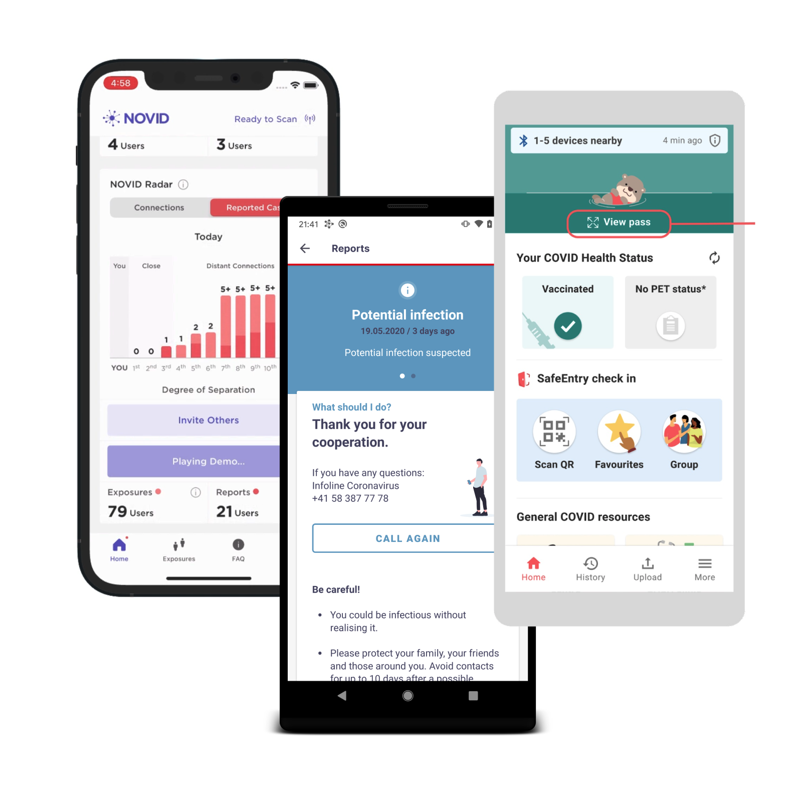
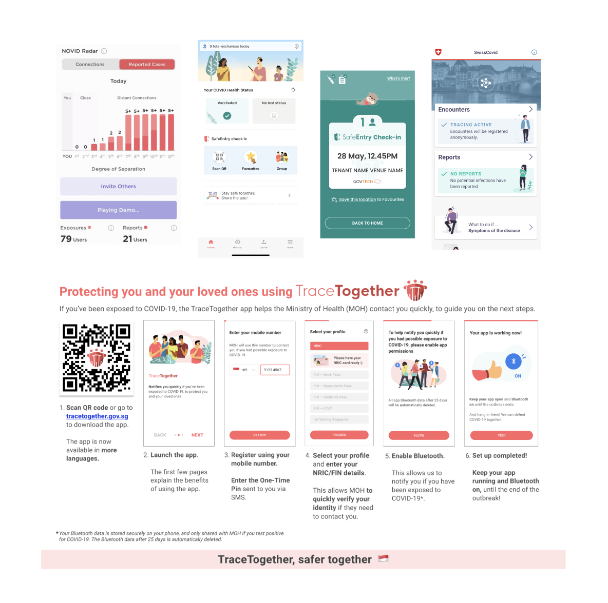
NOVID (U.S.), SwissCovid (Switzerland), TraceTogether (Singapore)
DESIGNING ALONGSIDE OTHER PROJECTS
Since contract-tracing solutions were being built by many teams for many different countries and states around the world, I conducted a competitive analysis to share some features with our team that might inform our chosen approach. At this point, we had been discussing an app design, so I focused mostly on apps that were being developed in the U.S. as well as multiple that had already been released in other countries (Singapore, Switzerland). From dissecting the functionality of these apps and their respective use so far in their regions, we were able to draw data supporting QR/code-based entry into community spaces as well as the quicker and more reliable Bluetooth signals for urban spaces where there was a higher volume of interactions.
DEFINING: A MULTI-PLATFORM SOLUTION
One of the primary insights developed from the research period was that in order to access as much of the population as possible, we would need to create a combined data base using multiple tools. All would pull from hospital data and individual user-supplied data to create their own individual features, with several tools with cross-platform access. I was assigned to work as the sole UX designer for the app team, and began a second short research period to support an app-based approach. I also provided writing and narrative support to the text-bot team during this time.
DESIGN PROCESS
After our initial research period and presentations to the Senegalese government, the executive team decided to work towards a multi-faceted solution to address the wide range of needs and technology access of the populace. I was assigned to work as the UX designer for the app team, and began a second short research period for an app-based approach. I also provided writing and narrative support to the text-bot team during this time.
EXPLORING EXISTING CONTACT-TRACING PATTERNS
Drawing from the competitive analysis I conducted earlier and some healthcare apps I had access to, I began to compile some design patterns that appeared in these apps as well as some healthcare apps I had access to that were available in Senegal. While this use case was unprecedented for the technology we now have, there were a lot of features that could be drawn from in creating an optimized display and set of features for people to have the best and fastest experience while using the app. Some common features between the apps included lots of access to reference information and explanations of different features and how to use them, as well as both a navigation bar at the bottom of the screen and scrolling information on the homepage. I also referenced their onboarding processes and the information and guidance they included at sign up for users.
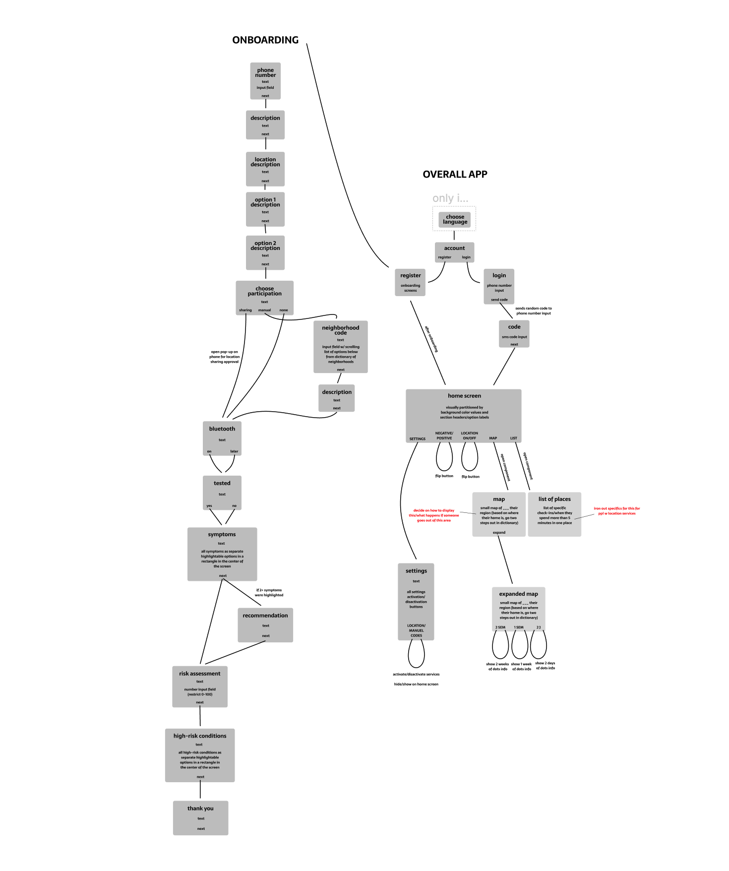
ONBOARDING AND DASHBOARD STRUCTURE DESIGN
As a deliverable to the executive team and to establish an understanding of the app structure for developers, who were already beginning work on the backend structure, I created a user flow diagram to establish the features we would be including in the app as well as the phases of the onboarding process and the information we would be collecting there. From this, developers were able to ask more specific questions about how to build out access features, and where specific tools would need to access data sets stored online.
REFINING ONBOARDING & SCROLLING SECTIONS
Drawing directly from the user flow, I sketched several sets of wireframes with different layouts for the onboarding experience and home screen/dashboard. The wireframe adjacent was chosen and I quickly created a mockup in Figma so I could run some testing with the team and our family members (3 team members, 6 family members ages 20 - 75).
From this testing, I learned that the onboarding was a bit too long - it's thoroughness became a drawback as users wanted to get to the information sooner. With this feedback, we were able to narrow down the onboarding to necessary and pertinent information for app functionality, and save other features for set up in the app. As for the dashboard, the users struggled to find specific information, and were discouraged by scrolling through information they had expanded to reach another section. To solve this, I changed the information from expandable sections into categories/features that could be clicked into and then backed out of.
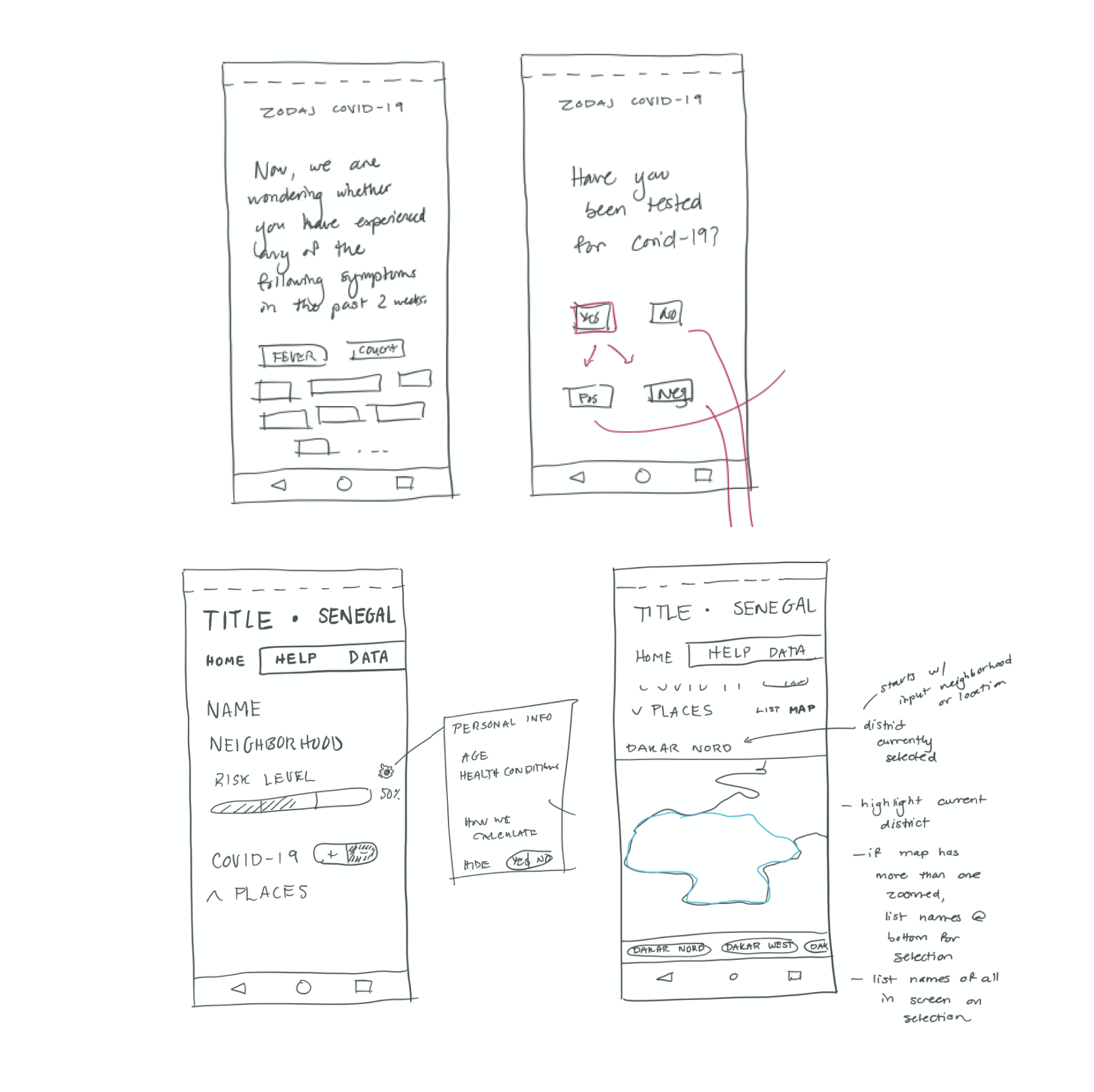
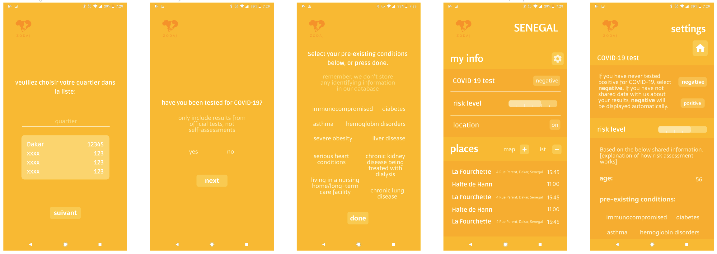
DIGITIZATION AND MONOCHROMATIC TESTING
Based on the feedback from testing with the wireframes, I created a shorter onboarding experience, as well as starting to design some of the interactions occurring within the dashboard while incorporating a folder structure for less scrolling. Additionally, we did not have a visual designer on this project, so while I was working on a design system with feedback from the executive team, I designed monochromatically using the company's primary color.
FIRST PRESENTATION TO THE STAKEHOLDER
With more direction from the executive teams, I narrowed down onboarding to very minimum, keeping all feature set-up in the app and only asking for the most basic start-up information. I also had to increase the fidelity more significantly than I would have normally during this step to keep up with the short timeline and for presentations to the Senegalian government. Since the development was working almost in tandem with the UX process, a lot of the UX interactions had to be approved so that the development team could work. The map feature present earlier was also scrapped for the first release due to timeline and lack of resources, so I redesigned the "Exposures" section of the dashboard to be more text-based rather than visual and interactive. The design system I had been developing was also finalized in this fidelity for the development team's ease of implementation.
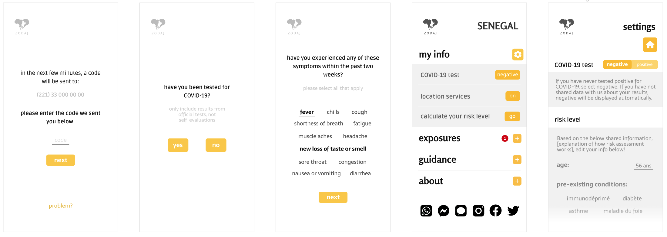
DEVELOPMENT-READY PROTOTYPE
The high fidelity phase came after feedback and collaboration with the development team, and added a lot of the more detailed interactions. Some displays had to be changed to account for variable information as well as lengthy French-language text. The original version kept all of the possible symptoms visible to parse to reduce scrolling, but it could no longer hold all the possible symptoms as more continued to be added. Some other design decisions from earlier were changed to accomodate changing information and changing priorities as more research was being published to the public.
TAKEAWAYS
Working in a startup for such a specific situation during a time of crisis was really valuable to my growth as an early designer. Here are a couple thoughts about what I learned following this experience:
↬ how to work with the information I had, not the information I wanted
↬ research anything I'm confused about and seek help from resources I have available to me
↬ how to ask efficient questions
↬ be both intentional and flexible with my decisions to adapt to changing priorities and situations
↬ taught me my limits on project capacity, how to prioritize and communicate about these abilities
↬ value of working interdepartmentally
↬ value of having coding knowledge (both front-end and back-end) for UX design
This project also taught me how to work in very vague and stressful circumstances. The requirements were not always clear, and the whole team worked hard while being spread very thin. I learned a lot about the value of constant, clear communication. I really appreciated my manager on this project for her extensive effort to address any questions we had both as a team and individually. It was a great experience of working in healthcare technology on a small team, and I learned so much in a short period of time.
Other Work
CareDesigned an application for caregivers and doctors to improve communication between the parties and thus the care of patients.
Anti-TrashResearched problem spaces in recycling habits and developed a simple solution that allows consumers to be better recyclers.
Bloomwood Stories: The Block PartyConducted long-term literature and user research to design a health-literacy game for underserved communities in the US.