
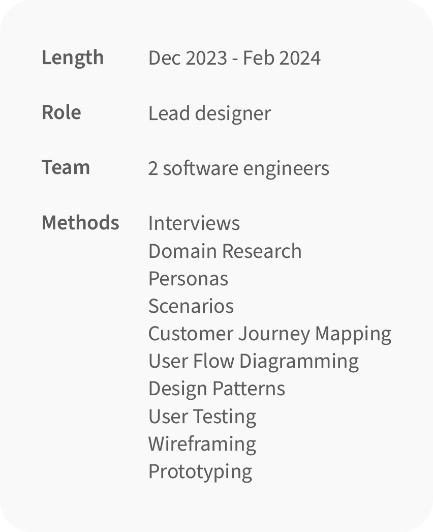
PROBLEM
Informal caregivers who live far away from their loved ones struggle to provide care because of the lack of structure regarding direct contact with the patients professional caregivers.
SOLUTION
"Care" provides a direct line of contact between informal caregivers and professionals, allowing them to share information directly through the app and the caregiver to easily schedule and attend appointments for and with the patient.
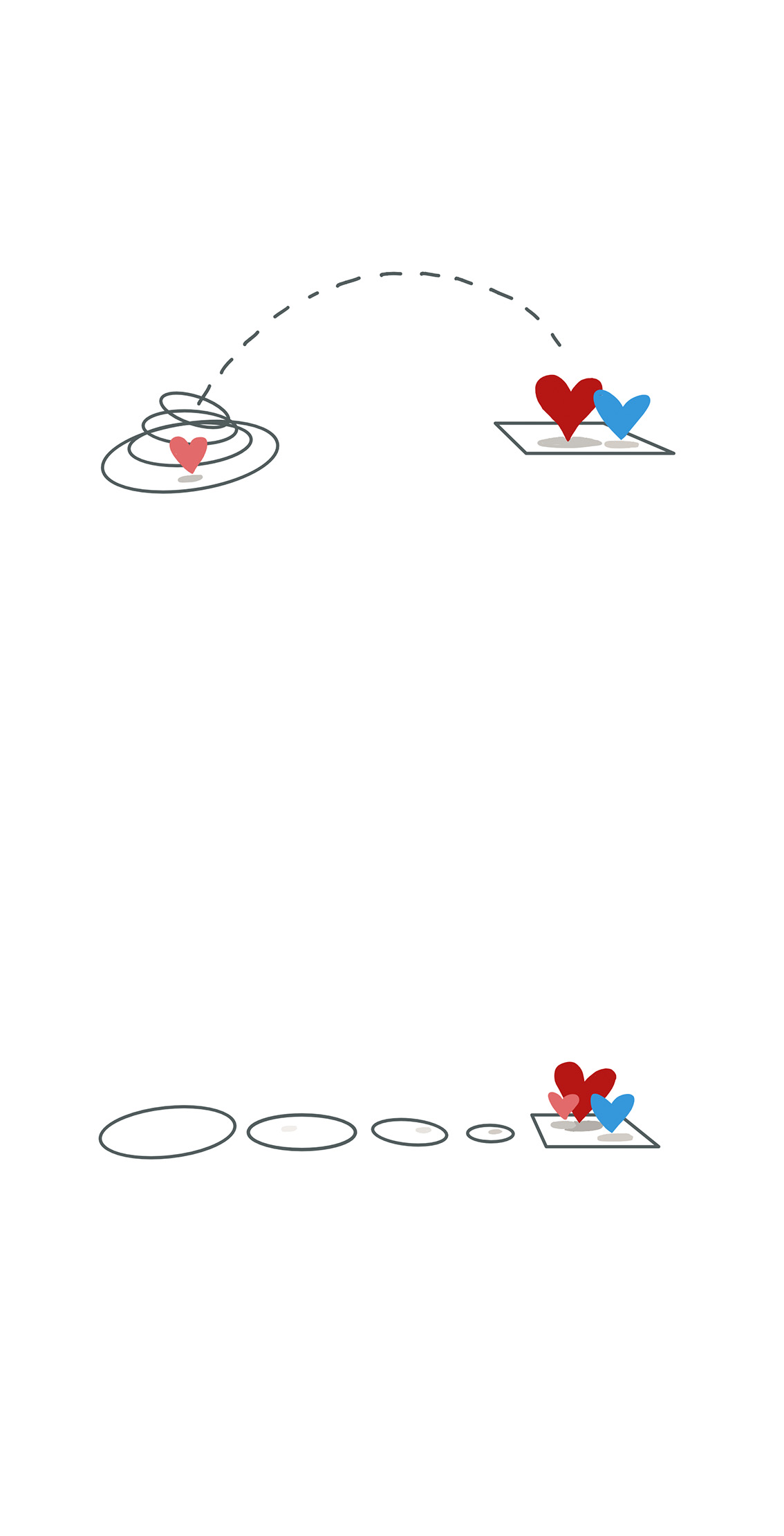
CREATING A DIRECT CONNECTION
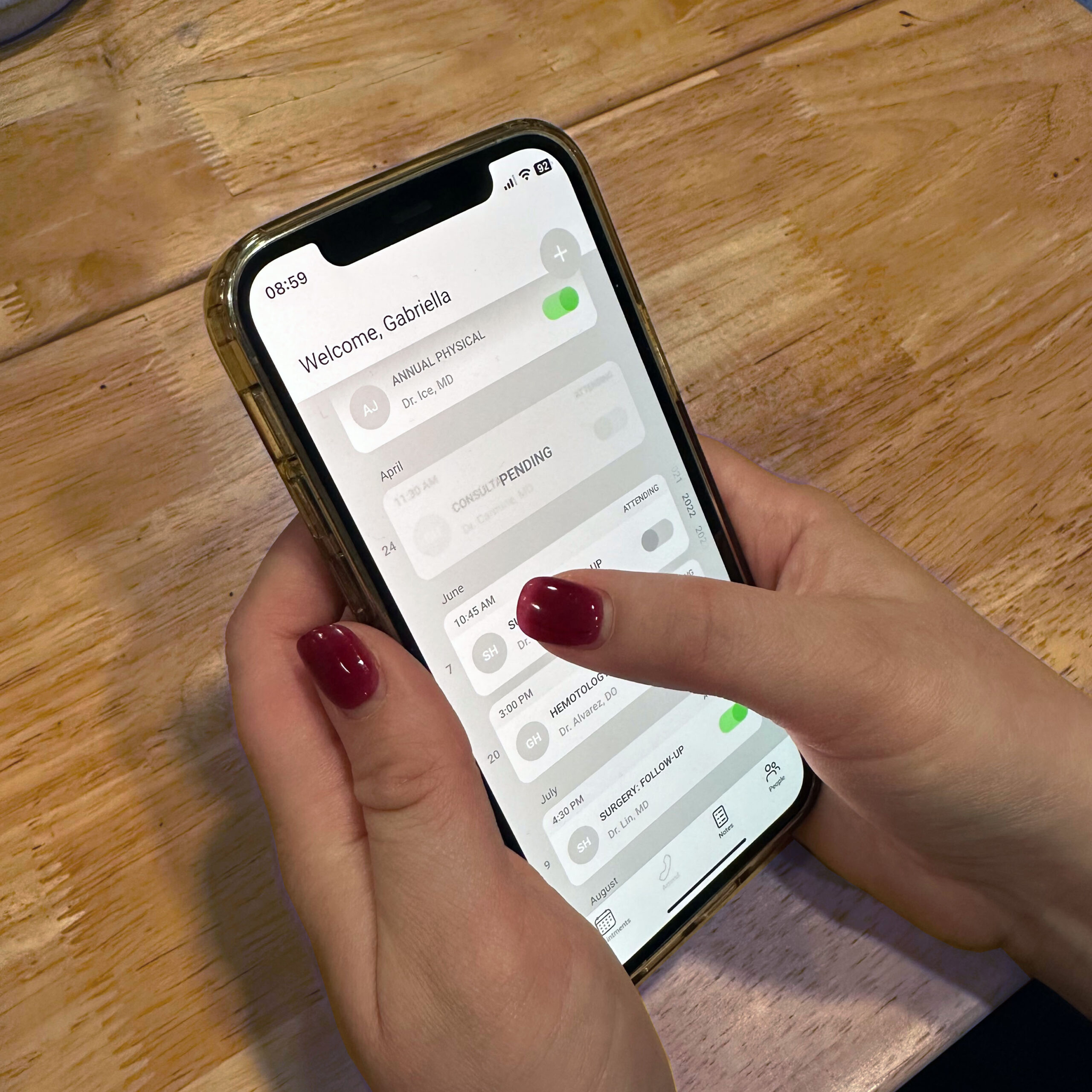
FINAL DESIGN
My final design took time to address multiple user contexts, and allowed caretakers and doctors to access, share, and record information that previously would have been filtered through either the patient or secondary modes of communication.
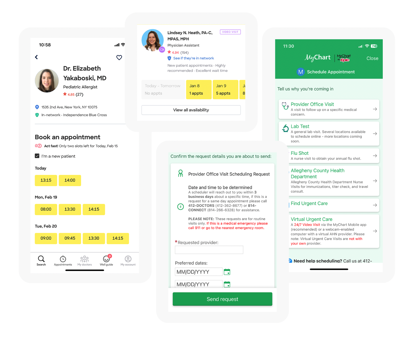
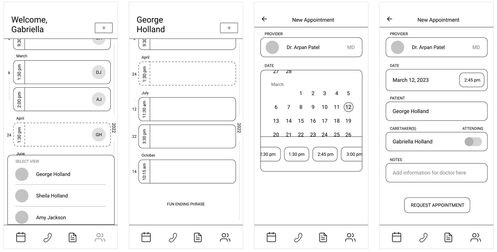
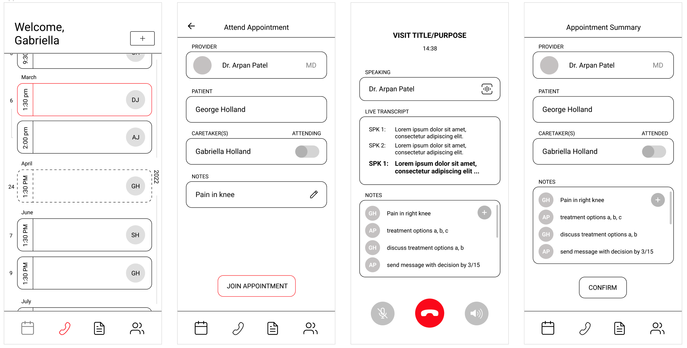
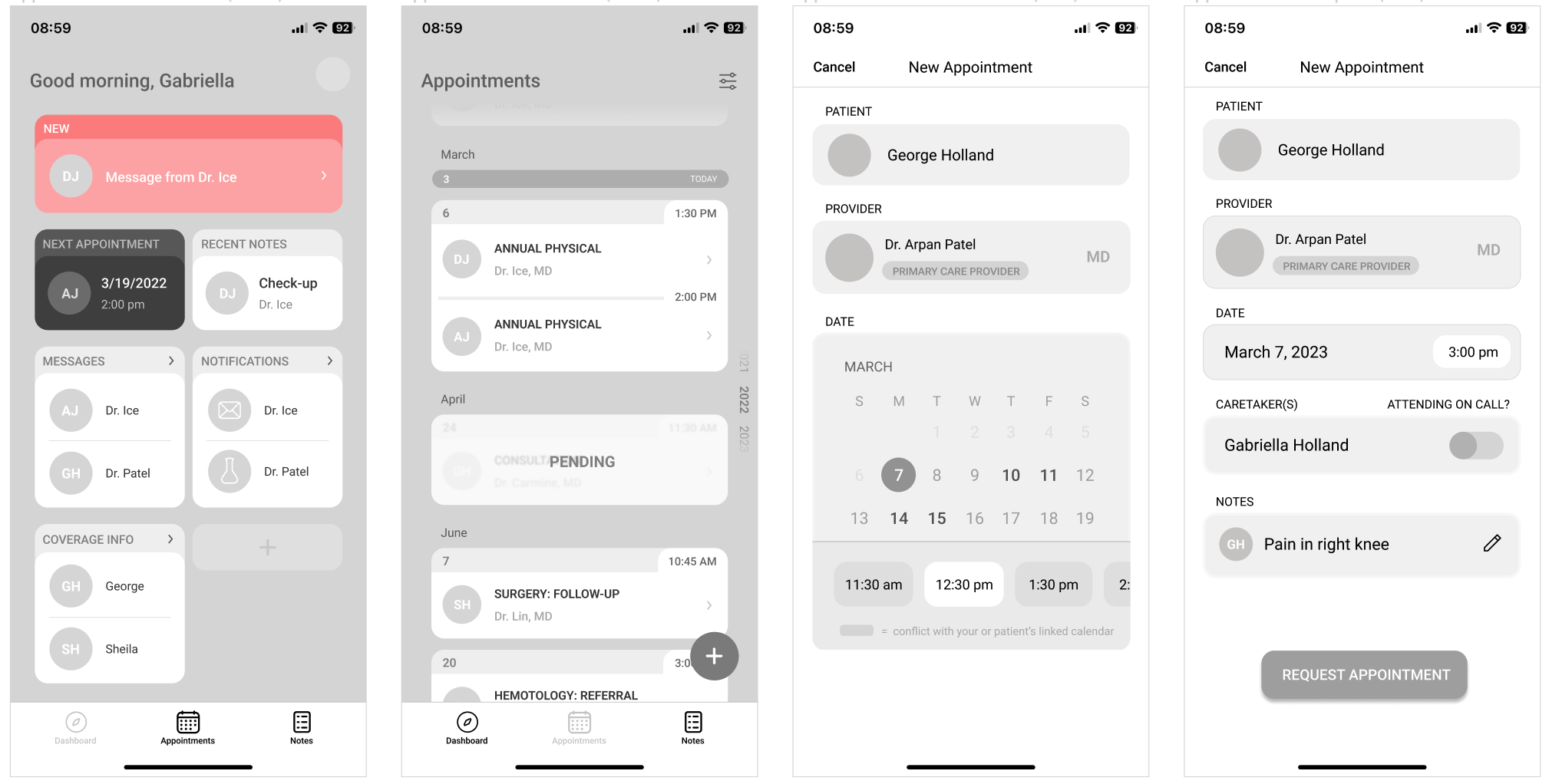
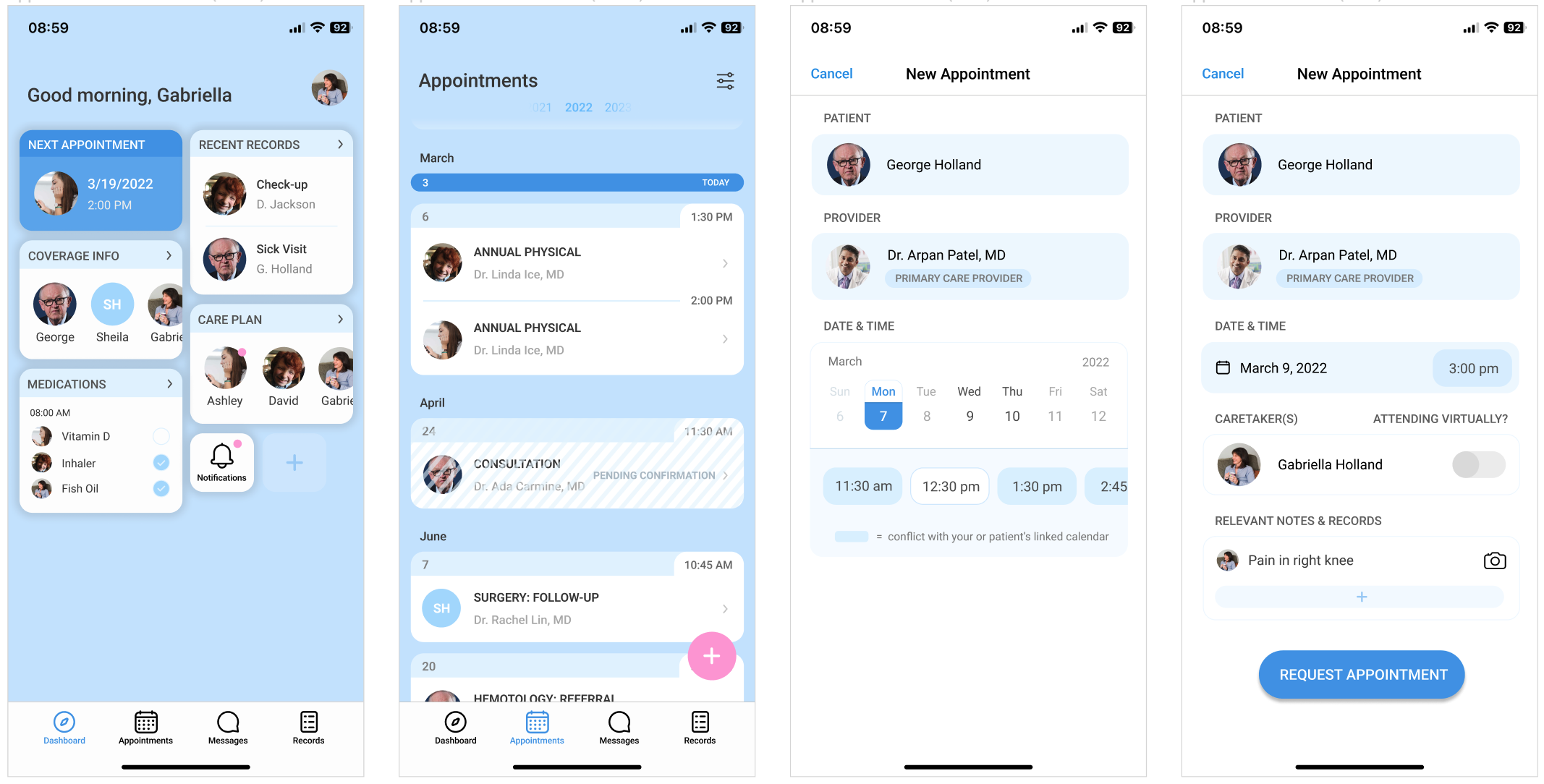
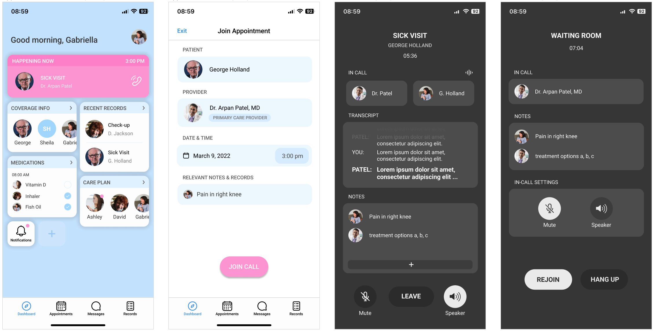
APPOINTMENT SCHEDULING
Digital scheduling tool - Allows caregiver to schedule appointments that coordinate with their, the patients, and the doctors schedules in one place without having to reference multiple data sources or make multiple phone calls.
Previous records of appointments - Caregivers can easily access records from previous appointments, even if they weren't able to attend through the audio recording and doctor notes.
Upcoming appointments - Unconfirmed appointments are slotted into the main calendar for reference, but will appear as pending until the doctors office accepts the request.
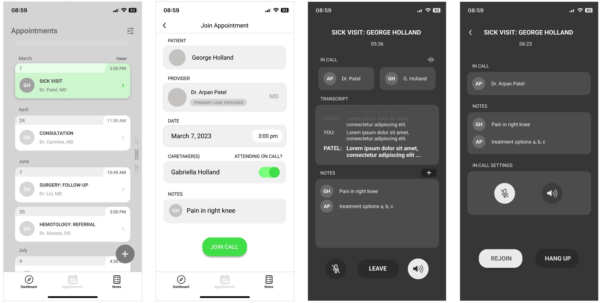
VIRTUAL APPOINTMENT ATTENDANCE
Pre-appointment notes - Access to pre-visit comments from the informal caregiver allows the doctor to provide efficient and relevant care during the patient's visit, and do additional research beforehand about any issues the patient might be experiencing.
Audio calling - No video means the doctor can focus on patient care, and the caregiver cans easily access the call transcript and conversation points of interest. Keeping the call in-app provides information security, and allows all records to be stored in the same place.
Post-call record access - The call record, important notes made by the caregiver and doctor, and any care plans are available through the appointment log or the records feature.
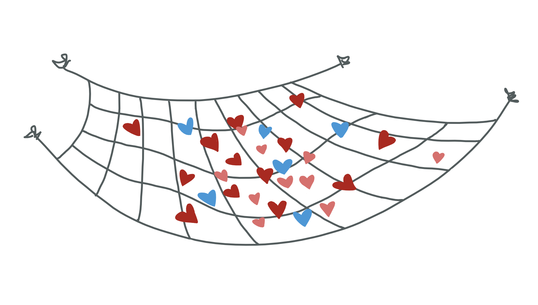
A MISSING PIECE
BRIEF
Informal caregiving is a field that almost every individual has personal experience with, whether that be through direct involvement or observation of a friend or family member. Often a daily task, caregiving without training can be hard for many reasons, whether it be dual-income couples attempting to support an elder as well as children, or the simple act of coordinating who has completed which tasks hour to hour. Miscommunication and lack of communication can lead to informational and logistical breakdowns that cost precious money and time to fix.
In what ways does informal caregiving need support?
How can informal and professional caregivers better coordinate care through an app-based solution?
RESEARCH PROCESS & INSIGHTS
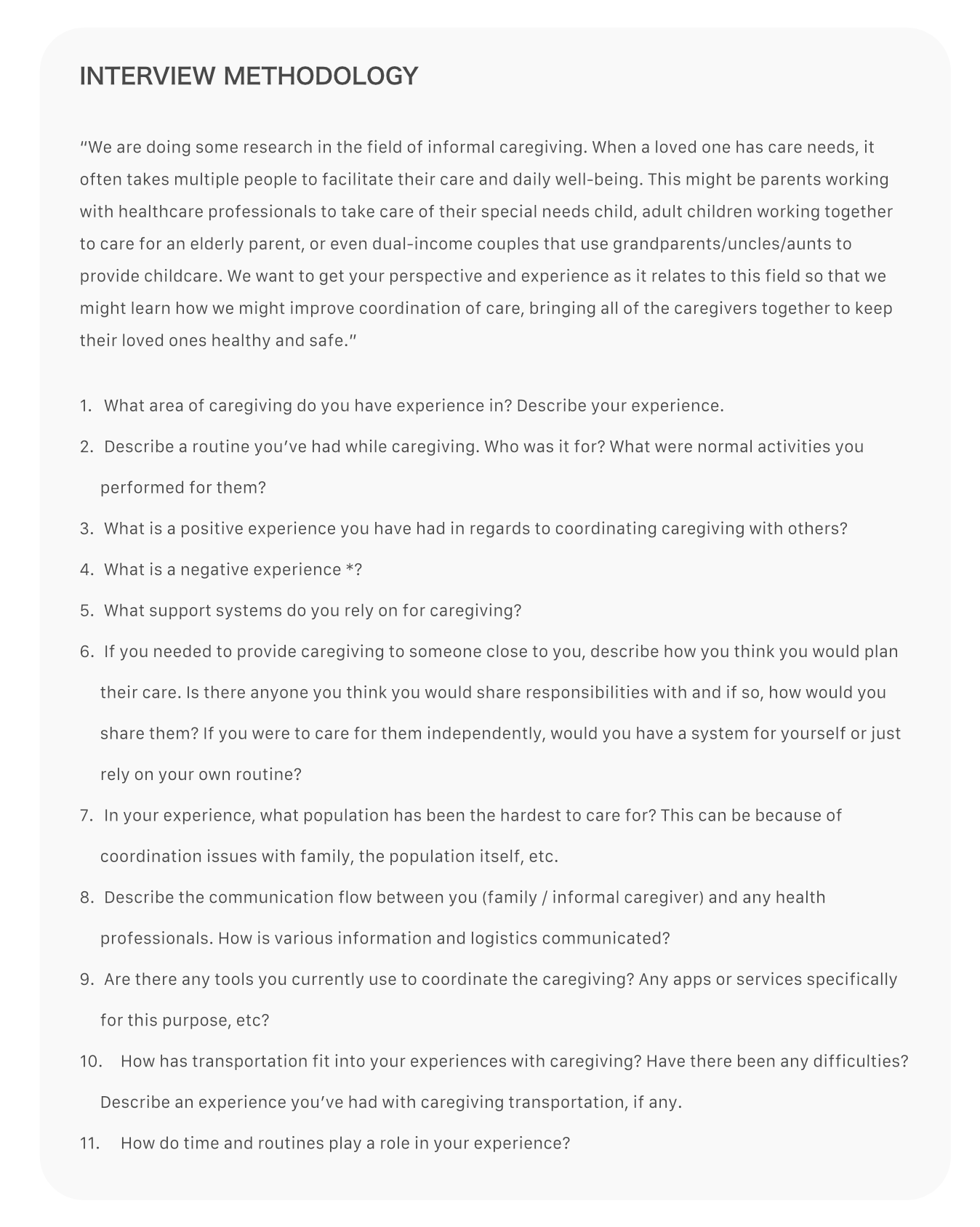
CONVERSATION WITH OUR TARGET POPULATION
We began by conducting a thorough investigation into the current problems facing informal caregivers. We created 11 broad-topic interview questions for the initial information gathering with the goal of then being able to scope in an area where there was the most opportunity for aid.
Through interviews with nurses, informal caregivers, and a therapist, we learned that the greatest issue seemed to be distance between the caregiver and the patient. Caregivers who had a professional caregiver living with the patient or who were in close proximity did not feel as though they had any issues with the information flow or their ability to keep up with the well-being of the patient. However, long distance caregivers’ inability to be present physically to attend appointments and manage other details that the patient cannot keep track of themselves led to forgotten prescriptions and missed or unscheduled follow up appointments.
ANALYZING EXISTING RESEARCH & IDENTIFYING POTENTIAL STAKEHOLDERS
After interviews, we also conducted research in the general field of informal caregiving. We discovered that caregivers want technology and information that adhere very specifically to their needs. Direct instruction and understanding of when facilitation is needed is what caregivers want, so they don’t have to invest more time than necessary. Caregivers look for tools that are easy to access and use and that don’t require a financial investment. They also need to know how to prioritize different parts of care to determine correct practices.
In addition, based on this research, we decided to focus on an insurance company as our stakeholder. Long-term care for the elderly is one of the most expensive areas for insurance companies, so we thought they might be interested in our solution.
IDENTIFYING MARKET COMPETITION
For our competitive analysis, we looked at both currently available health care apps as well as the types of services available to informal caregivers. Most focused around providing a platform to connect families with professional at-home caregivers, or were specific to healthcare providers such as myUPMC and myChart. However, these apps only provide care and information to patients. There are also apps that allow a caregiver to monitor a loved ones vitals or medication remotely, which doesn't factor in communication with healthcare professionals.
IDEATING USE CASES WITH USER PERSONAS
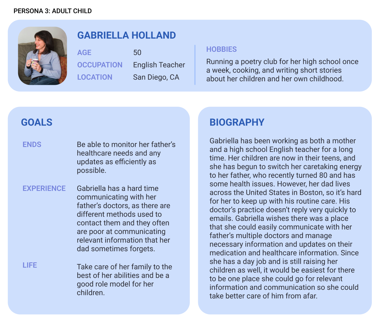
The next step was to use these insights and create user personas to depict the stakeholders and users of the app. We chose to create a persona and scenario for a patient, an informal caregiver, a doctor, and an insurance company, who was our envisioned stakeholder. While we did not anticipate the patient using the app, we did want to document their process and situation to understand how to help them. From these personas, we were able to determine specific pain points about each group we studied- for the informal caretaker "adult child" persona, we explored availability difficulties for parents who were taking care of their parents as well as their own children.
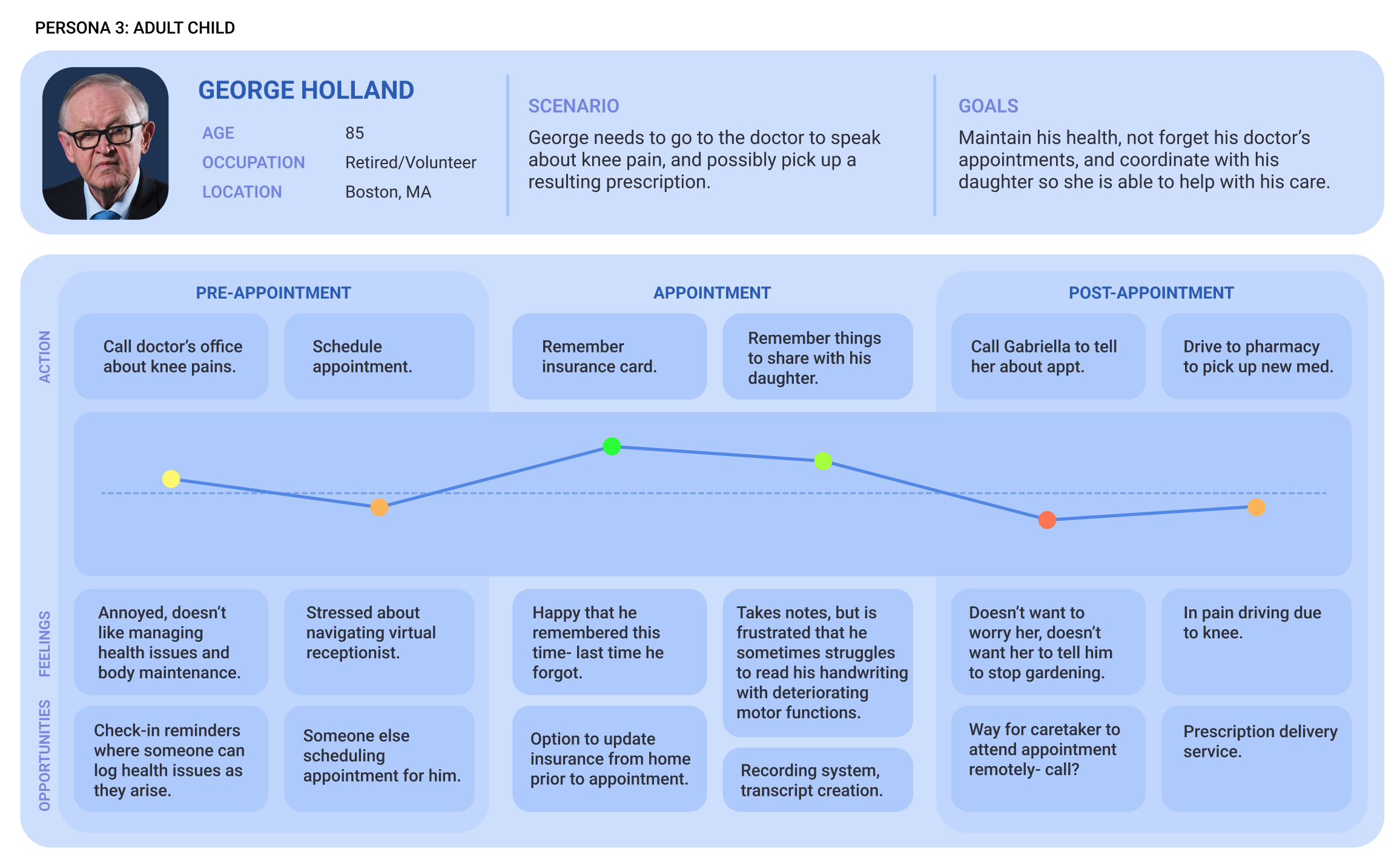
GEORGE'S PAIN POINTS
Furthering our visualization of situation and context for our users, we created customer journey maps to understand our users current process. Our journey maps showed us that there were a variety of pain points for each person, so a dynamic solution could provide relief in several different points of the process for different people. For example, providing a way for the caregiver to attend the patients doctors appointment would remove the patient task of relaying information from their healthcare professionals, and the worry that comes for the caregiver in hoping the patient did not forget anything. This would also reduce time consumption answering caretakers questions for doctors and associated personnel at the office.
FOCUS & FEATURES
Based on our research, we concluded that our focus should be issues surrounding creating and attending doctors appointments. Our goals for our solution included minimizing the time the healthcare professional and long-distance caretaker need to spend outside of appointments communicating about the patient.
1. Scheduling system
2. Video calling appointment
3. Note and record sharing
DESIGN PROCESS
EXPLORING EXISTING HEALTHCARE APP PATTERNS
With our context and goals in mind, I began with a design pattern audit of patterns present in healthcare apps with similar features as ours.
For scheduling, I looked at the design flow for appointment creation in Zocdoc and MyChart. From these systems I learned information priority in terms of time and date availability and doctor availability: only display available times, and hide or grey out unavailable options. This enables the user to choose efficiently, and leads to more scheduled appointments.
For calling, I studied call screens for audio calls, as well as meeting room-type patterns such as those experienced in audio Zoom and Google Meets calls. Another example we leaned most heavily on was online therapy providers' systems and their layouts.
For other features, we looked at information organization on a medication tracking app and a personal care app.
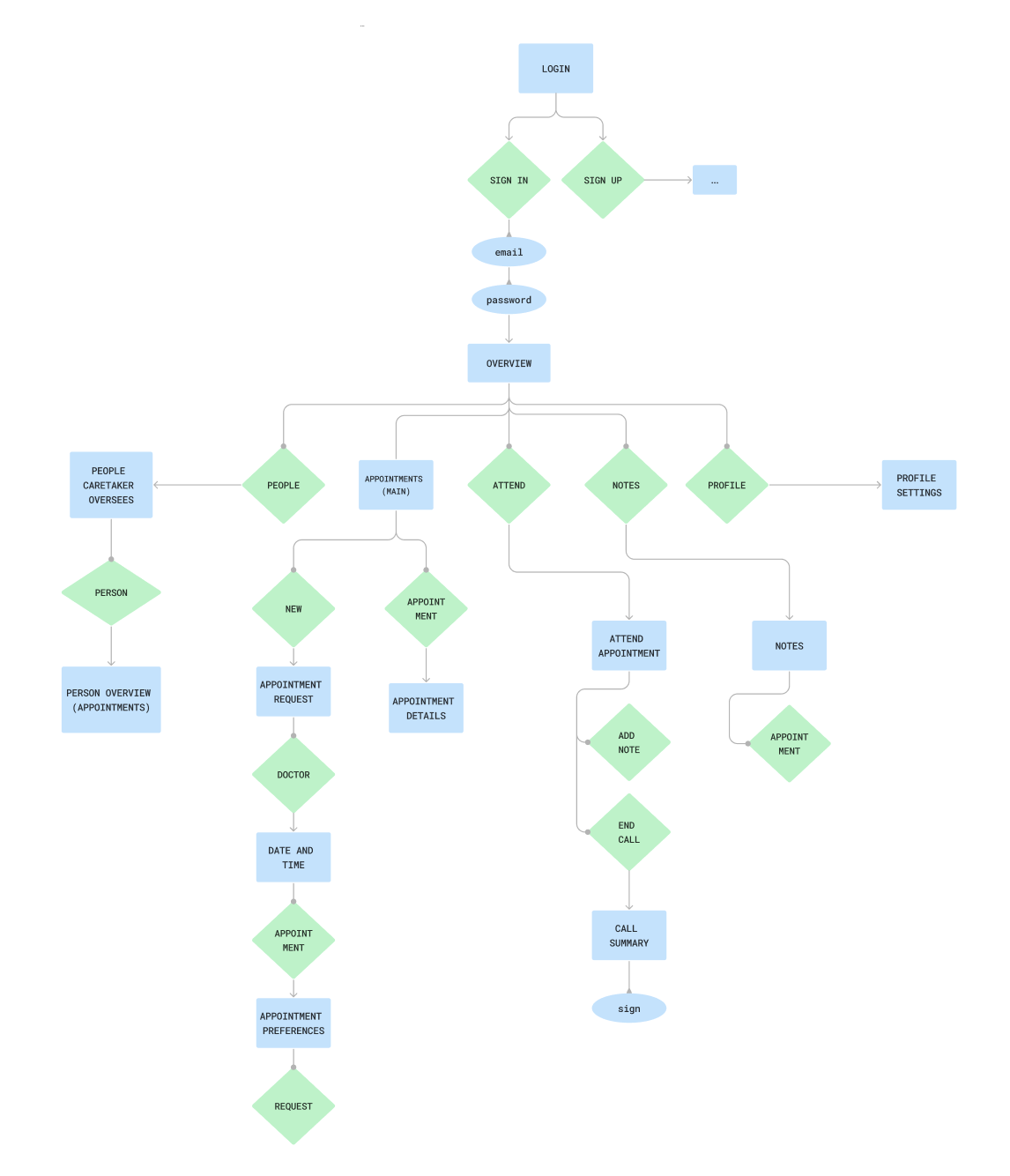
DESIGNING STRUCTURE
To outline our wireframes prior to making them, I created a user flow diagram to collaborate on the structure of the app before I got into sketches, so we would know how we could organize information and features effectively. As I continued with wireframing, I referenced areas I wasn't planning on creating to reduce redundancy in my designs. Additionally, I chose to move forward with only the caregivers side of the app at this point since we didn't have enough to reference from research interviews and doctor's side design patterns. The doctor flow's lacked efficacy, and I didn't feel that time would be well spent on speculative designs without concrete background completed- especially in such a short time frame.
REDUCING NOISE
In creation of the initial wireframes, both analog and digital, I thought through the general layout and how I wanted the caretakers to experience the app in its entirety. What features did I want to be clickable immediately, and what details did I want to be folded into a secondary screen?
After reviews, we discussed our priorities and narrowed our energy into two specific scenarios. These wireframes showed us where we needed to scope down, as well as indicated user comfort with the layout. Before this, we were thinking too broadly about the app as a whole and about insignificant elements that were not important to overall functionality. One example was that the caretaker did not need to be on a video call for the appointment, as the information that needed to be exchanged could be through voice/transcript, and managing a camera while maintaining confidentiality and comfort for the doctor and patient was not a priority.
DEFINING
The situations we chose to create for two full app flows from this point were:
1. The caregiver needs to make an appointment for a patient.
2. The caregiver needs to attend an appointment virtually.
DIGITIZATION AND SUPPORTING DECISIONS
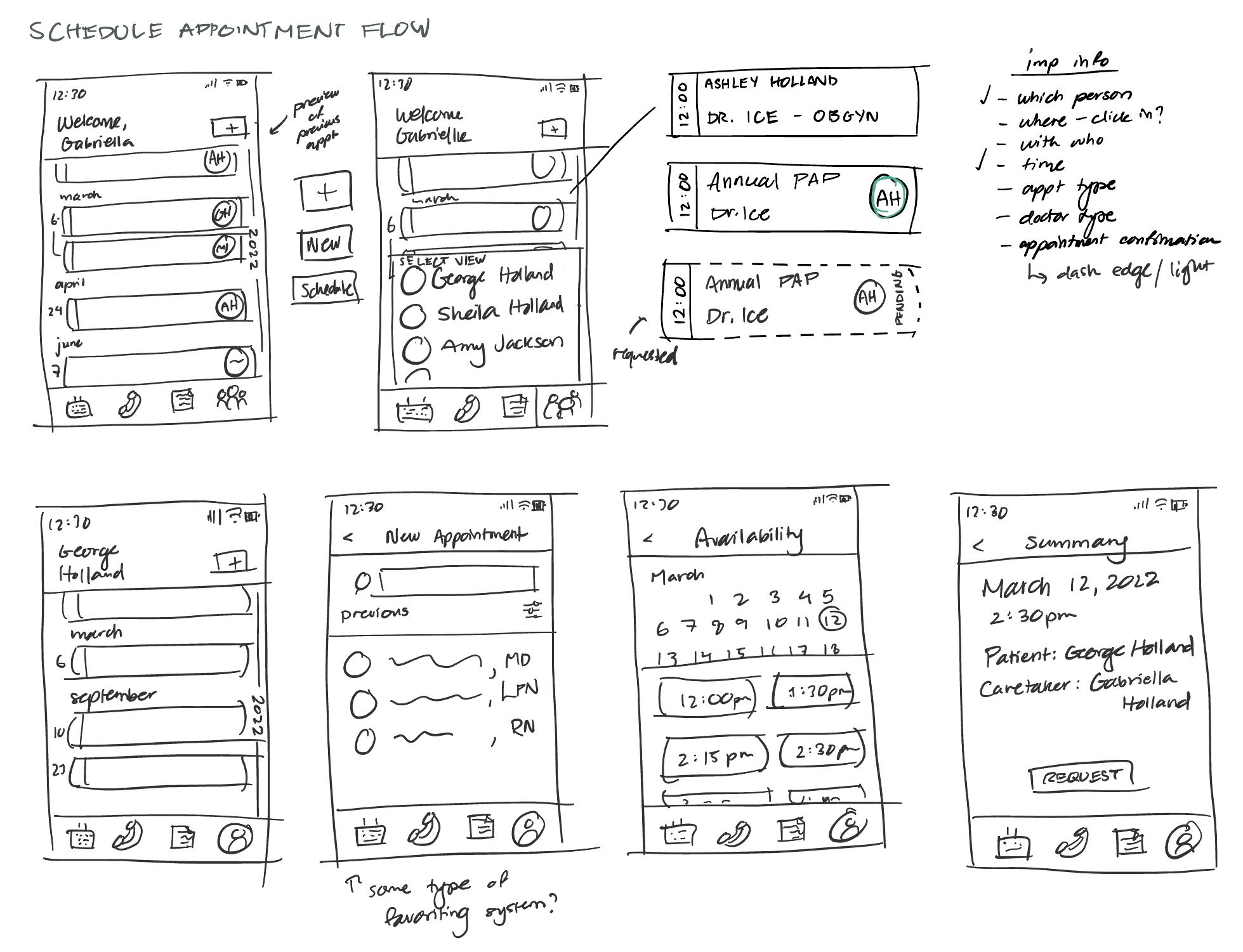
For the low-fi model, I digitized the wireframes I had sketched in Figma while refining and reworking preliminary choices I had made. I identified a need for more visual guidance through typical use cases, and added basic iconography and layout indicators. For this stage, I focused on primary screens and organization as opposed to more detailed choices. Reducing repetition, standardizing button design, and following Gestahlt principles in associating sections were all focuses of this stage of design. I also began copywriting testing, seeing which words created the correct feelings, motivations, and understanding in the user. I also added affordability through scroll indicators and display conditions prior to applying more advanced visual techniques.
Appointment creation flow
Appointment attendance flow
PREPARING FOR TESTING
To create the first testable prototype, I refined the low-fi screens and added the other screens required to create the full flow. I added a monochrome theme to test visual hierarchy and guide the users eye to relevant features. I also added in more consistent iconography, and implemented several edge cases to test with users. I reorganized other features (like the time display next to the in-call notes) to remove redundant and low priority information. I also reworked elements of the design based on the visual hierarchy I was implementing, such as turning the dashed border of the pending appointment card into an opaque cover. The dash called too much visual attention to it, and pending appointments were supposed to be less noticable than finalized appointments. With this prototype, we went into the first round of testing.
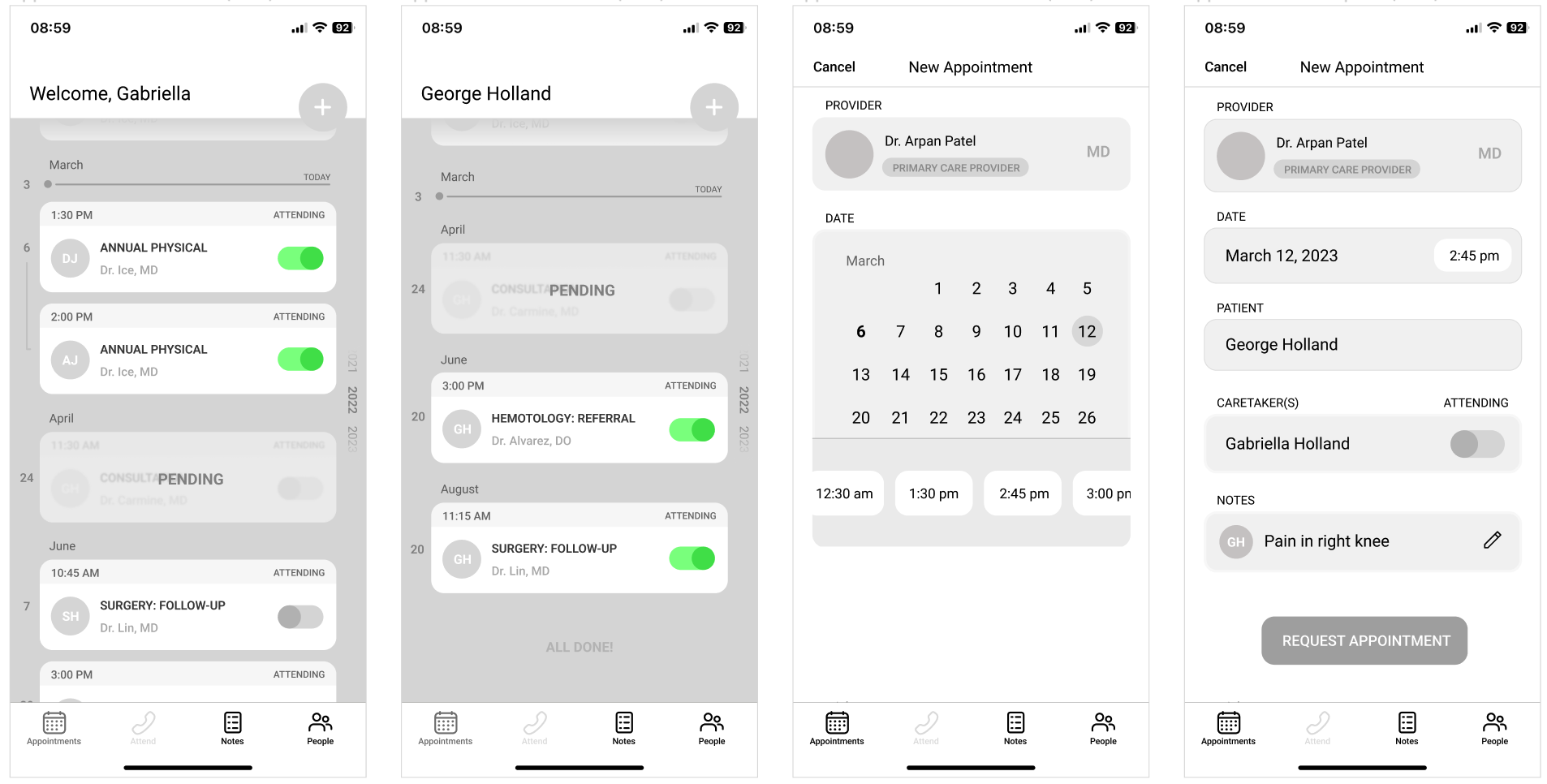
Appointment creation flow
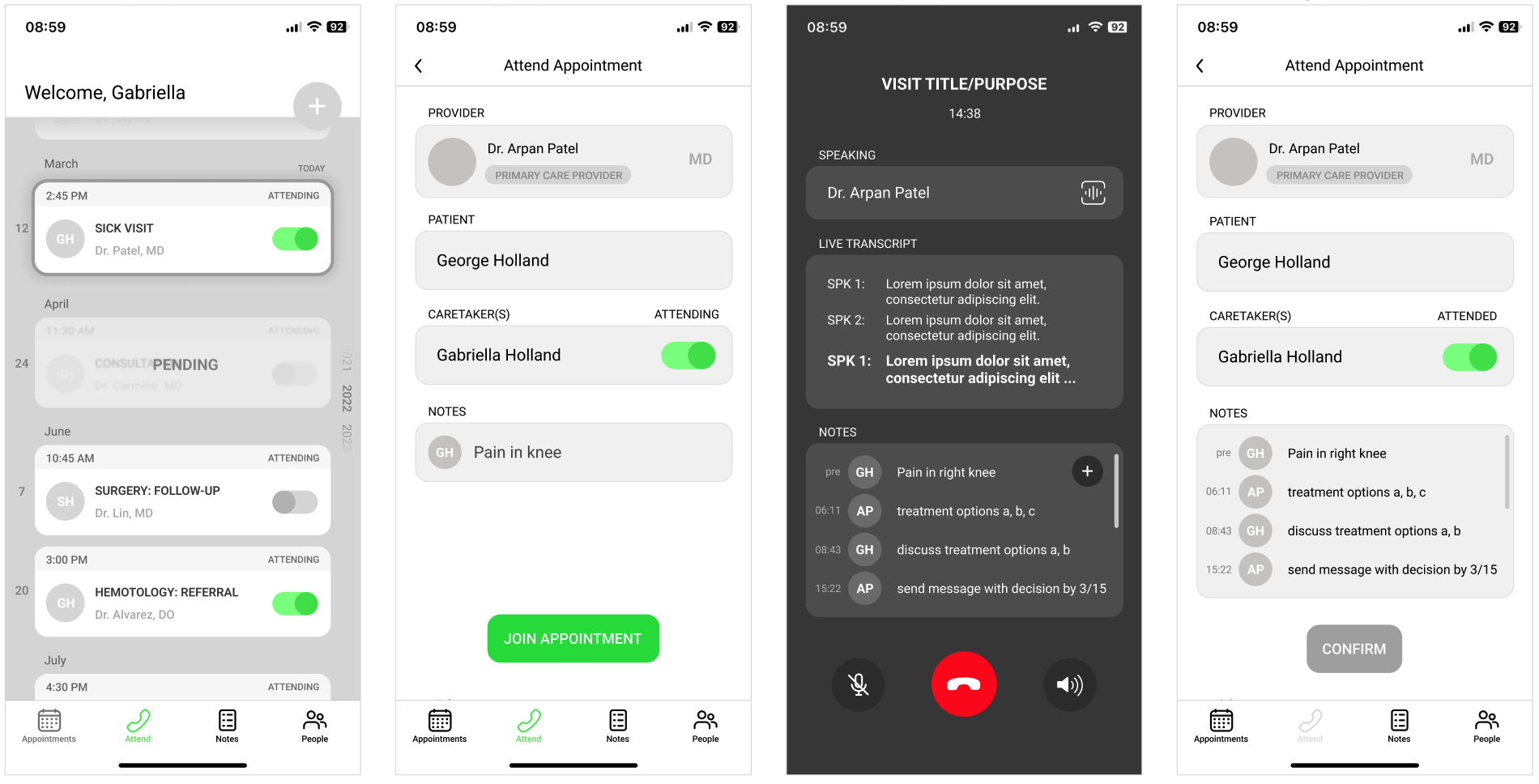
Appointment attendance flow
TESTING WITH POTENTIAL USERS
The first testing round included 2 subjects: a nurse and a long-distance caregiver. I constructed a brief to introduce the project and the task they were completing for each flow, as well as introducing the stream-of-consciousness technique for them to use throughout the process. I would also be observing and taking notes on their behavior as well as any comments they made throughout the process.
There were several key takeaways from this first round of testing, but the most major was the need for an anchoring page. After research and pattern analysis, I noticed that the majority of the healthcare apps included a homepage that didn't have a lot of function, or served as just a menu. To try to create larger purpose for the main page of the app, I chose to use the appointments timeline in place of this as a central hub for the app. However, the design pattern of a homepage was too strong, and not including something for the user to return to as a home base required more time to understand and adapt than it should.
CREATING FUNCTIONALITY IN EXISTING PATTERNS
Based on the first round of testing, I wanted to make some major changes to part of the structure and add a dashboard for users to return to and reorient themselves if ever lost in medical records. I wanted to respond to my intuition of the examples having under-utilized home pages, and I decided to create a widget system with quick access information and tracking. This also touched on a goal I had to reduce clicks between opening the app and reaching the information the user needed. Additionally, some features needed more guidance for efficient user decision making, as well as responding to the emotions users expressed in certain situations and how to support them. One example was the in-call screen- while using the iOS design patterns was intuitive, it stressed out both test subjects, and the red button made them feel like if they left the call they would not be able to return. I also removed several features that weren't being used, like the attend call menu button, which neither of the subjects used in preference of the clickable option closer to the top of the screen. Other changes included adding structure to the scheduling calendar, and rapid prototyping of the appointment cards to find a design that was cleaner and more intuitively inserted into a timeline structure.
Another important piece I returned to in this phase was how to tie in stakeholder interests, and with available space on the home page, I created a widget where insurance information for each patient could be stored and easily referenced by the caregiver- the goal being to reduce customer service time and improve patient and caregiver understanding of their benefits.
Appointment creation flow
Appointment attendance flow
DASHBOARD AND FURTHER FLOW TESTING
After the redesign, I tested with another long-distance caregiver. I used the same brief and protocol as the first round of testing, with the only difference being that this testing was conducted virtually through screen-sharing and video call. I again took notes and provided minimal guidance only if the user was very stuck or confused- usually just reminding them of their goal in "opening the app."
This tester differed from the first two in that they had a lot of questions in their stream-of-conciousness about copy and the dashboard iconography, which was likely related to the earlier stage of the dashboard compared to the rest of the flow. The feedback on copy was helpful in determining some changes in terminology I needed to make, as well as spaces for animation to confirm user interactions to reduce the need for additional copy.
One of the biggest takeaways I had from the testing portion of this design process was the complications of testing with an "in-use" prototype. In order to test the features that I was focusing on, the app had to be already initialized and filled in with a lot of background information. While following design patterns was largely successful in supporting user understanding of unfamiliar features, there were some questions and feedback that were off-topic due to the style of the testing. In the future, I would likely build out a simple walkthrough/set-up for testers to familiarize themselves with the app prior to the official testing to reduce tester confusion. I would also focus less on including edge-cases in the testing prototype, and have a separate set of frames for edge-cases.
INCREASING VISUAL FIDELITY
At this stage, I spent time ironing out final details, as well as cleaning up elements of the design that needed extra time. One such element was the "pending" appointment cards, for which I conducted rapid prototyping to explore solutions where users could see the appointment information while also using clear visual indicators of a "pending" status.
This stage was also the period where I put a heavy focus on visual design, working on creating a design system and reworking existing visual decisions like gutters, margins, and visual indicators of progress. I also reworked some visual language choices I had made that users revealed were confusing in testing, as well as adding relevant minor features to their appropriate sections, such as the camera ability for the appointment creation notes.
Now with testing data for the dashboard design, I reduced the amount of information present, and finished the collection of "starting" widgets for the dashboard. The ones present in the testing were the ones that would be a base set-up, and the user could add and remove widgets for their own needs, making the homepage functional for each individual.
Across the app, I made sure that a clickability design pattern was used clearly, and marked placement of behavior-confirming animations for the development team ("pending added" animation, phone ringing for join call button). I also removed the messages widget from the dashboard in favor of a quick access button on the static navigation- messages can include a lot of information, so the user can quickly reference information from anywhere in the app. I also added a "next appointment available" date to the appointment creation doctor section, so users can choose the best option for their needs faster. I also made an app-wide change to rename the "notes" feature to "records", as the terminology notes only makes sense for the in-meeting element of the feature. I made final changes to copy as well to clarify concepts, navigation, and information priority.
Appointment creation flow
Appointment attendance flow
TAKEAWAYS & NEXT STEPS
This project was an important exercise in work distribution between teammates, and allowed me to explore collaborative techniques working with engineers. A few other impactful points I learned on this project were as follows:
↬ the importance of testing with an early-stage version of the product
↬ how to integrate stakeholder interests into design choices
↬ opting in and out of design patterns that serve the product, testing to affirm or deny those decisions
↬ utility of rapid prototyping on details as well as structural decisions: the more iterations, the more intentional the design becomes
↬ prioritizing research-backed design
If we had the opportunity to pursue this project beyond the original timeframe and with more access to our end users, there were a few goals we had in mind:
↬ integrating with currently used medical software to reduce the doctor's need to manage and update multiple platforms
↬ a lot more testing with both caretakers and doctors to see how this would fit into the average routine during a visit, and see whether
further support is needed on either side
Other Work
VertexLead UI designer for a mobile app for Senegal's COVID-19 response.
Anti-TrashResearched problem spaces in recycling habits and developed a simple solution that allows consumers to be better recyclers.
Bloomwood Stories: The Block PartyConducted long-term literature and user research to design a health-literacy game for underserved communities in the US.